Limit your typefaces, and don’t get carried away with using lots of different fonts. Instead, select one or two fonts, three at the very maximum, deciding which font will be used for the header text and which will be used for the body copy. Opting for a font ‘family’ helps to take the headache out of matching and pairing different fonts, with basic, black, narrow, and bold variations of the same font to choose from.
Gaining control over your fonts eliminates the need to trial different combinations to find out what works and what doesn’t, and adds consistency throughout a single document or a series of projects.
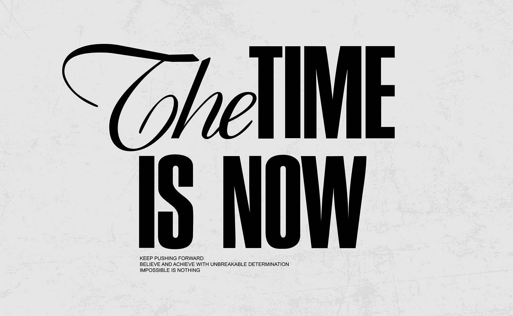
Keep It Simple and Consistent
When it comes to typography, less is more. Limiting your design to one or two typefaces—three at most—creates a clean and consistent look. Choosing a font family with variations like bold, narrow, and italic makes it easier to establish hierarchy without mixing too many styles. This not only keeps your work professional but also saves time experimenting with different combinations while ensuring your projects maintain a cohesive visual identity.
"Typography is two-dimensional architecture, based on experience and imagination, and guided by rules and readability."
Hermann Zapf
Typeface Designer
Mastering the art of font selection is about embracing simplicity and consistency. By limiting your typefaces and making use of font families, you create designs that are clear, professional, and visually harmonious. Thoughtful typography not only strengthens readability but also enhances the overall impact of your work—proving that in design, restraint often delivers the most powerful results.