Close your eyes for a moment and picture a colour. Now, think about how that colour makes you feel. Colours are emotive and often have strong associations to experiences, in fact ‘colour theory’ highlights the connection colours have with human behaviour.
Because a colour can communicate so much through its hue, start with a great colour palette. Try sticking to a colour scheme of one to three primary colours, and one to three secondary colours, to achieve a contrasting, complementary, and consistent palette.
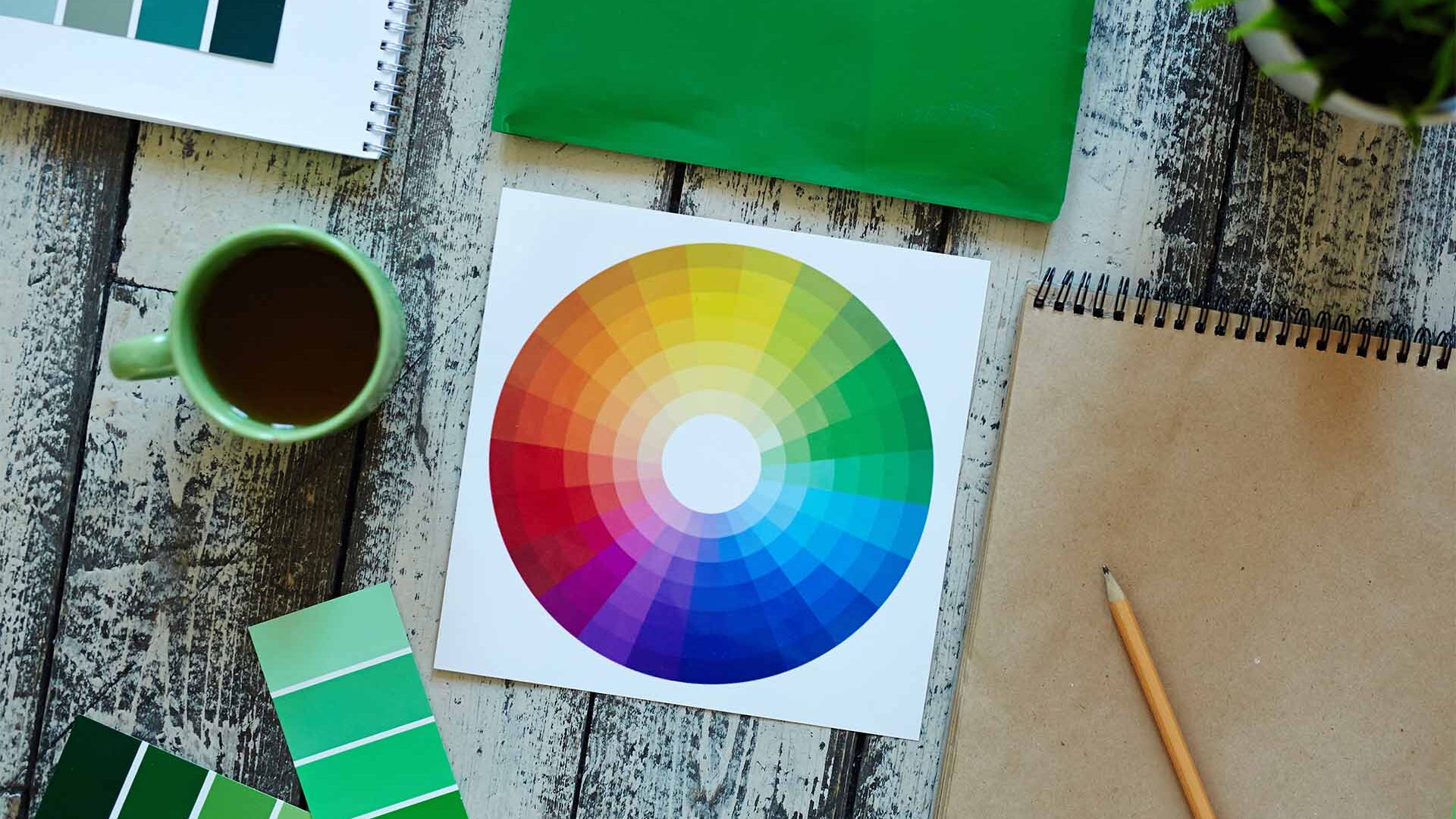
Try using a colour wheel or online tools to help you decide the perfect palette for you. Pick colours that work with the intended aim or message of your design, and avoid veering too far away from the mainstream to prevent confusing your audience.
Colour Done Right
Colour is one of the most powerful tools in design. It sparks emotion, sets the mood, and directs attention. Used wisely, colour elevates your message and makes your design memorable. Used carelessly, it can overwhelm, confuse, or even repel your audience. That’s why it’s not just about choosing colours you like—it’s about being colour clever.
“Color does not add a pleasant quality to design—it reinforces it.”
Pierre Bonnard
To “get colour clever” is to treat colour as both science and art. It’s about more than aesthetics—it’s about communication. When you use colour thoughtfully, you don’t just make something look good; you make it work.
So next time you’re tempted to pick colours at random, pause. Think about what story you want your design to tell, and let your colours do the talking.


Comments
Roger
Everything along the way, to and from, fascinated her: every pebble, ant, stick, leaf, blade of grass, and crack in the sidewalk was something to be picked up.
Samuel
Everything along the way, to and from, fascinated her: every pebble, ant, stick, leaf, blade of grass, and crack in the sidewalk was something to be picked up.